Project Introduction
Fly UX is start up company who is looking to create an online experience that is fast, easy, and intuitive: one that’s based on a deep understanding of their target users.
Project Scope - This project took 6 months to complete, but 3 months if full time
Project Goals - I want to create an airline prototype desktop that focusses on the flight booking process, using research and feedback from users
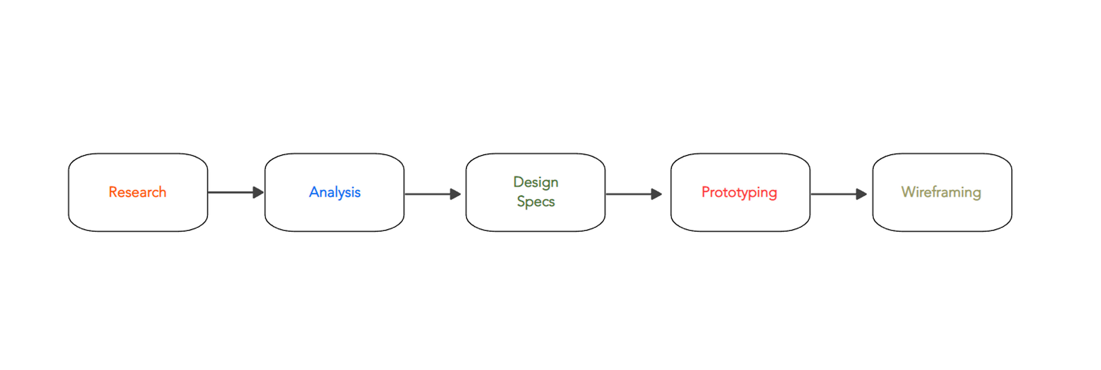
Methodology - Below is a diagram of the steps and methods I took on this project
Problem
Users who used airline platforms such as Euro Wings and Aer Lingus apps, had a problem in understanding what they were booking exactly, due to lack of information and flow of screen states.
Research
COMPETITIVE BENCHMARKING
Ryanair - the calendar and booking seats page is interactive for user toggling. The Flights Page did not display enough options
TAP Portugal - colours and branding are vibrant. The booking and flight search pages do not provide alternative options, and has 'attention please' message instead
ONLINE SURVEY
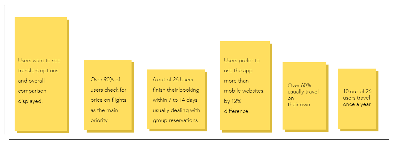
I created a online survey to learn more about the goals of people that use airline sites: what they are trying to do, whether anything is preventing them from doing it, and what other features they would like to see. These were key findings I had to consider.
Note Taking & Usability Testing
I conducted these methods on 3 users who interacted with 2 airline apps, Aer Lingus and Eurowings, with the following questions;
What do you see on the page?
What does this button/option mean to you?
Overall, what did you think of your experience?
Was there anything you expected to see?
Were there any surprises?
How do you find navigating this page?
Each test lasted about 45mins. Below is the users' main responses.

Analysis
After carefully analysing the data collected, I used the Affinity diagram technique to place all the notes into groups of screen pages, which became clear on what needed work on.
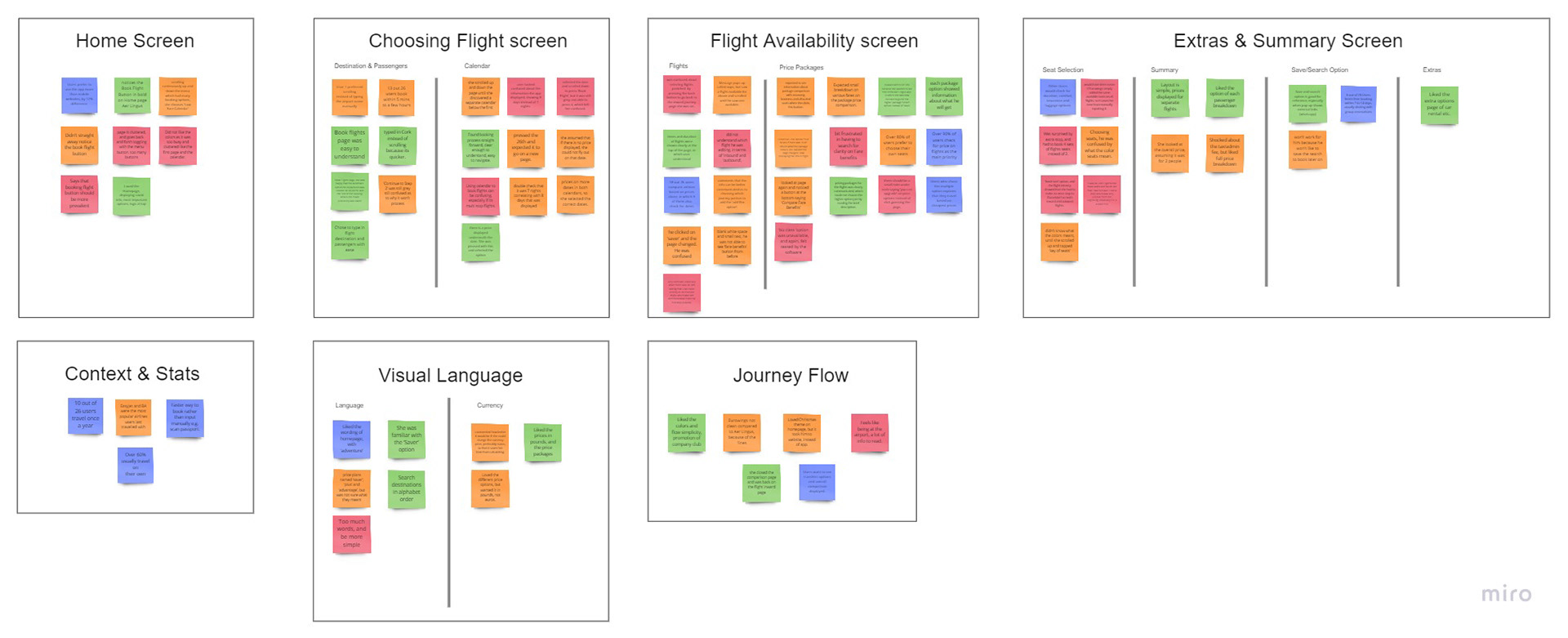
Without making any assumptions, I also created a customer journey map as a way to think about where the change of behaviours occurred during the process, and evidently there was a root problem discovered.

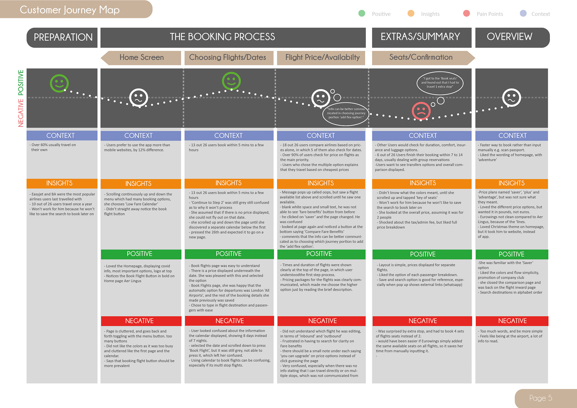
The Issue & The Solution
According to the customer journey map, I need to;
- remove ads, replace imagery and information on homepage
- make the booking section more clear with bold colors, symbols and buttons the user can understand
- edit the calendar selected dates, for user to understand
- make symbols aligned with text and colors
- make flight options more accessible and readable
- declutter step by step bar, and adjust text hierarchy
Design Specs
Interaction Design
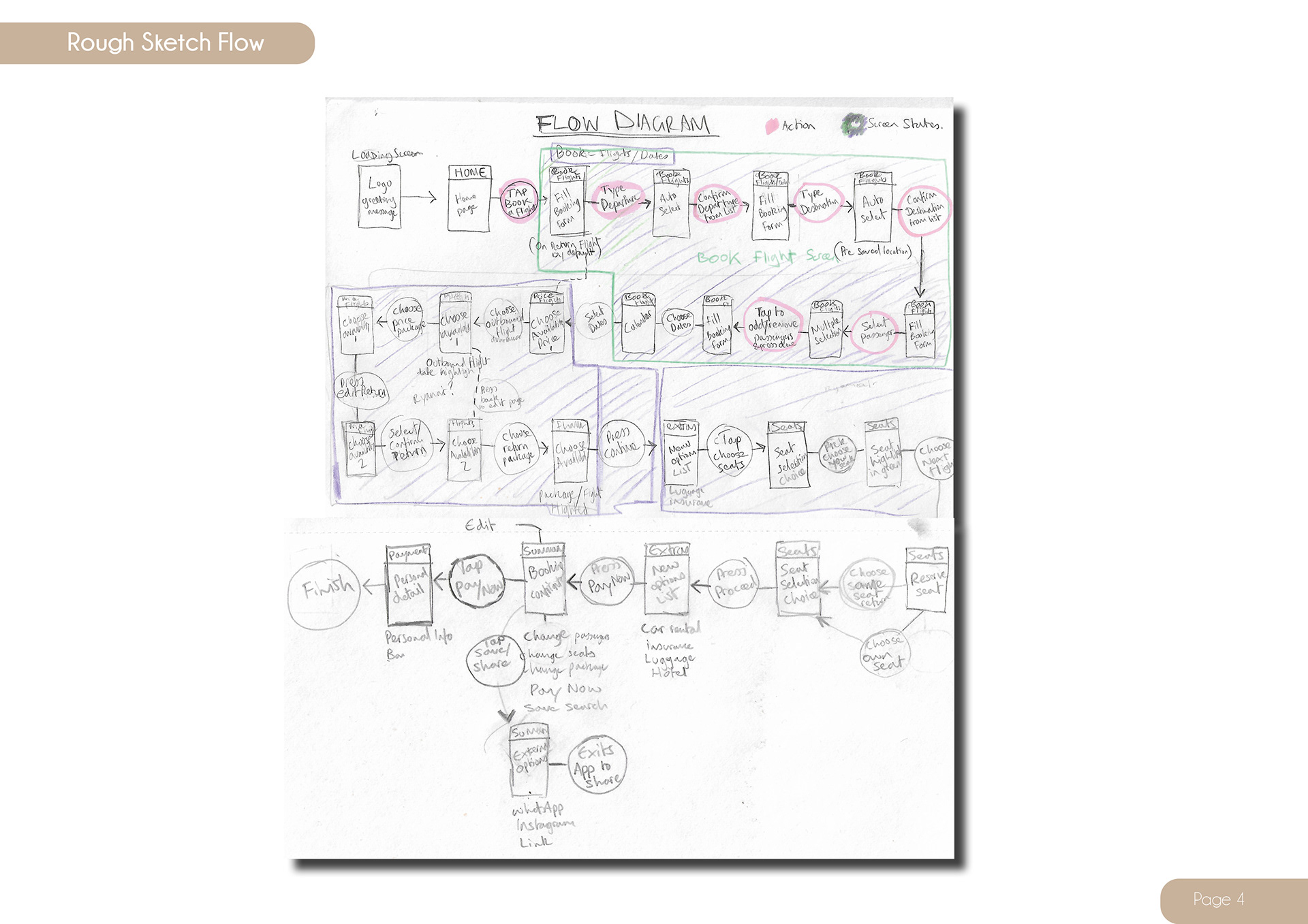
I began sketching and experimenting with different screen states on a flow diagram to find ways in making the overall booking process run as smoothly as possible.
Once I was happy, I created the digital version, still referring back to the Customer Journey map as a guidance.

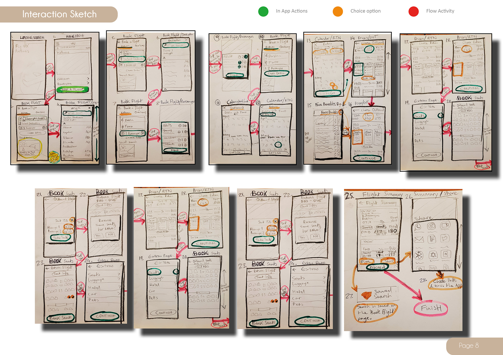
I started creating low fidelity sketches of what each screen state would look like in detail.
Still referring back to the Customer Journey map as a directional compass.
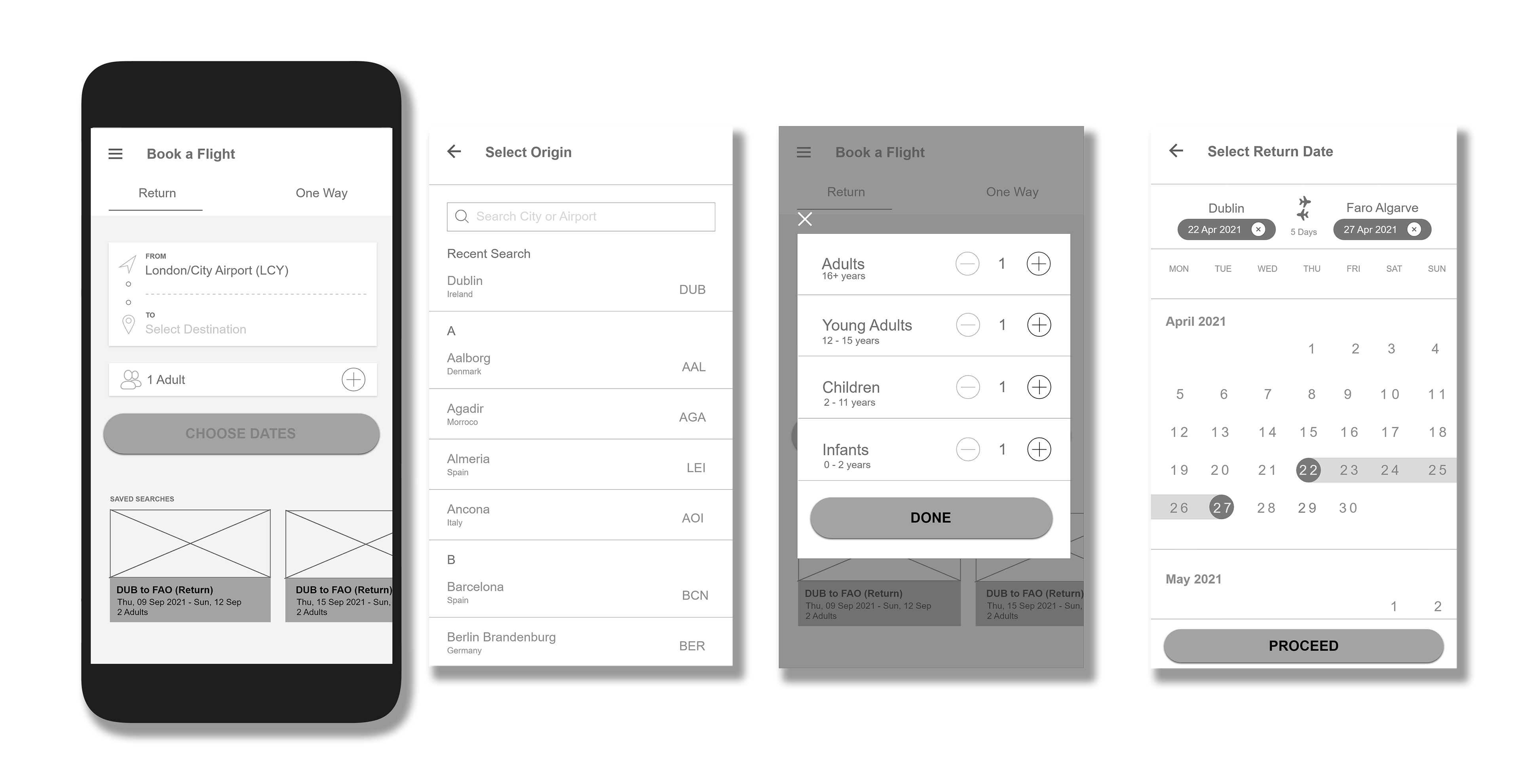
Prototyping
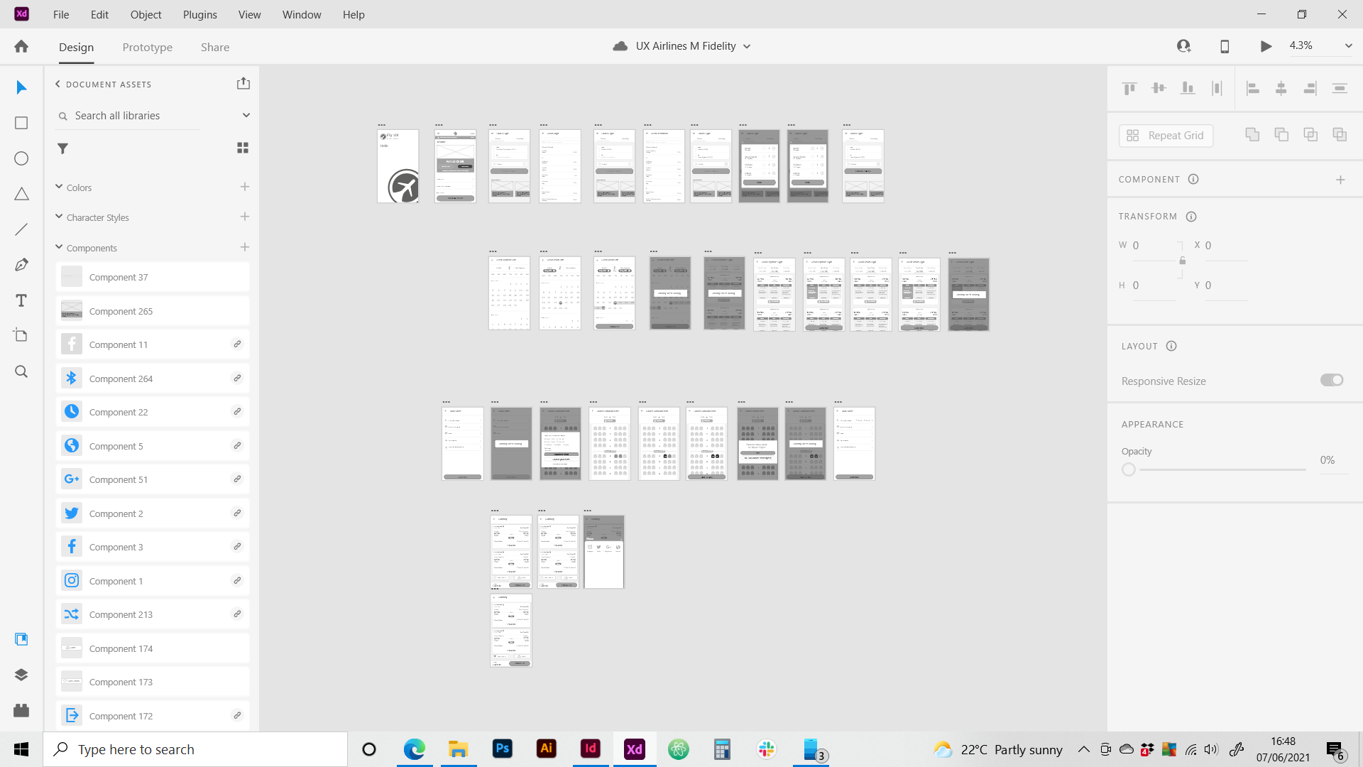
Medium Fidelity Prototype
After taking it to Adobe XD, I realized that I needed to add in loading screens to make the experience more informative for the user
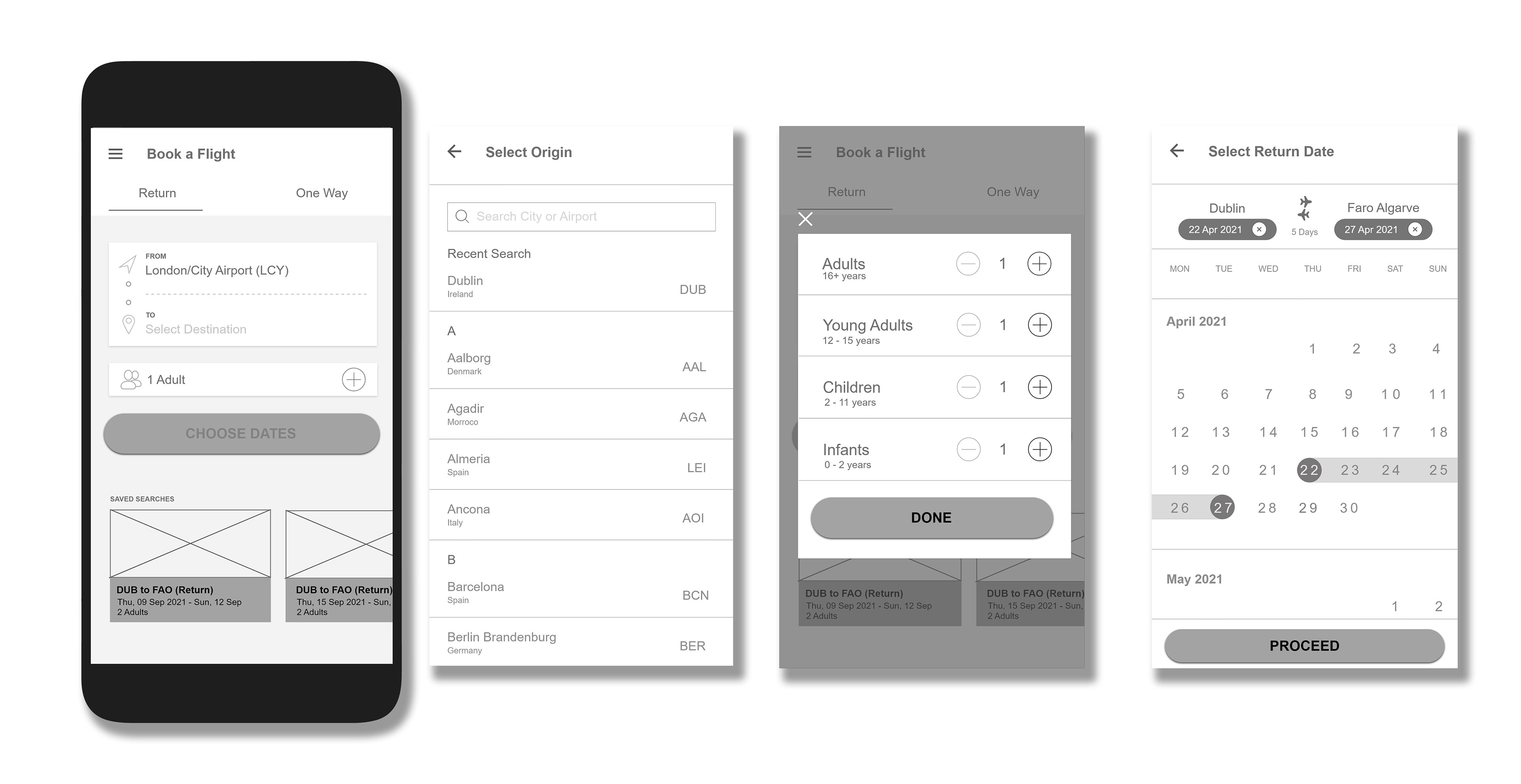
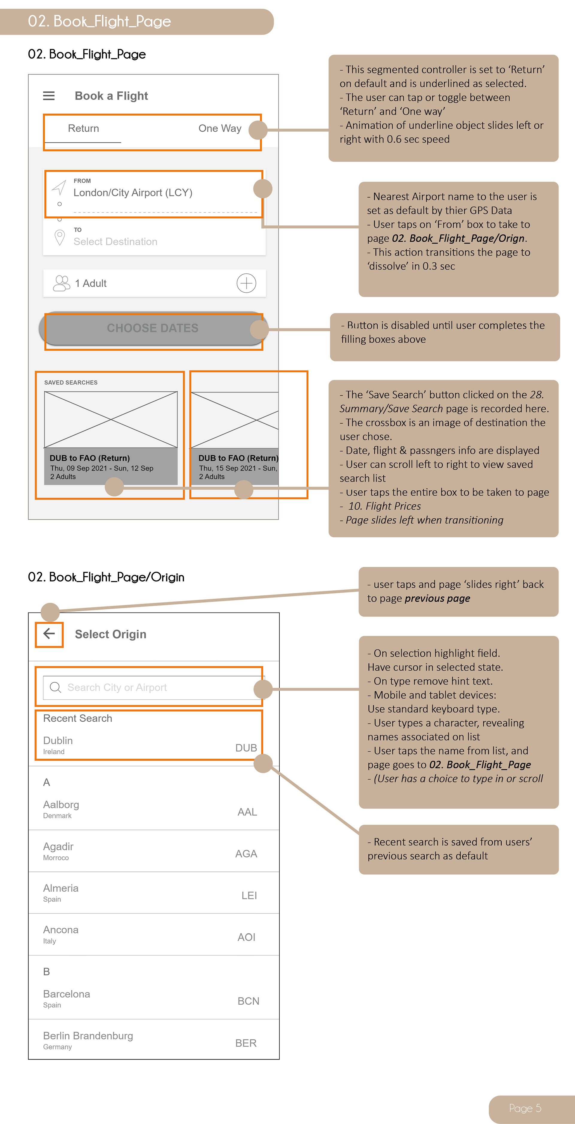
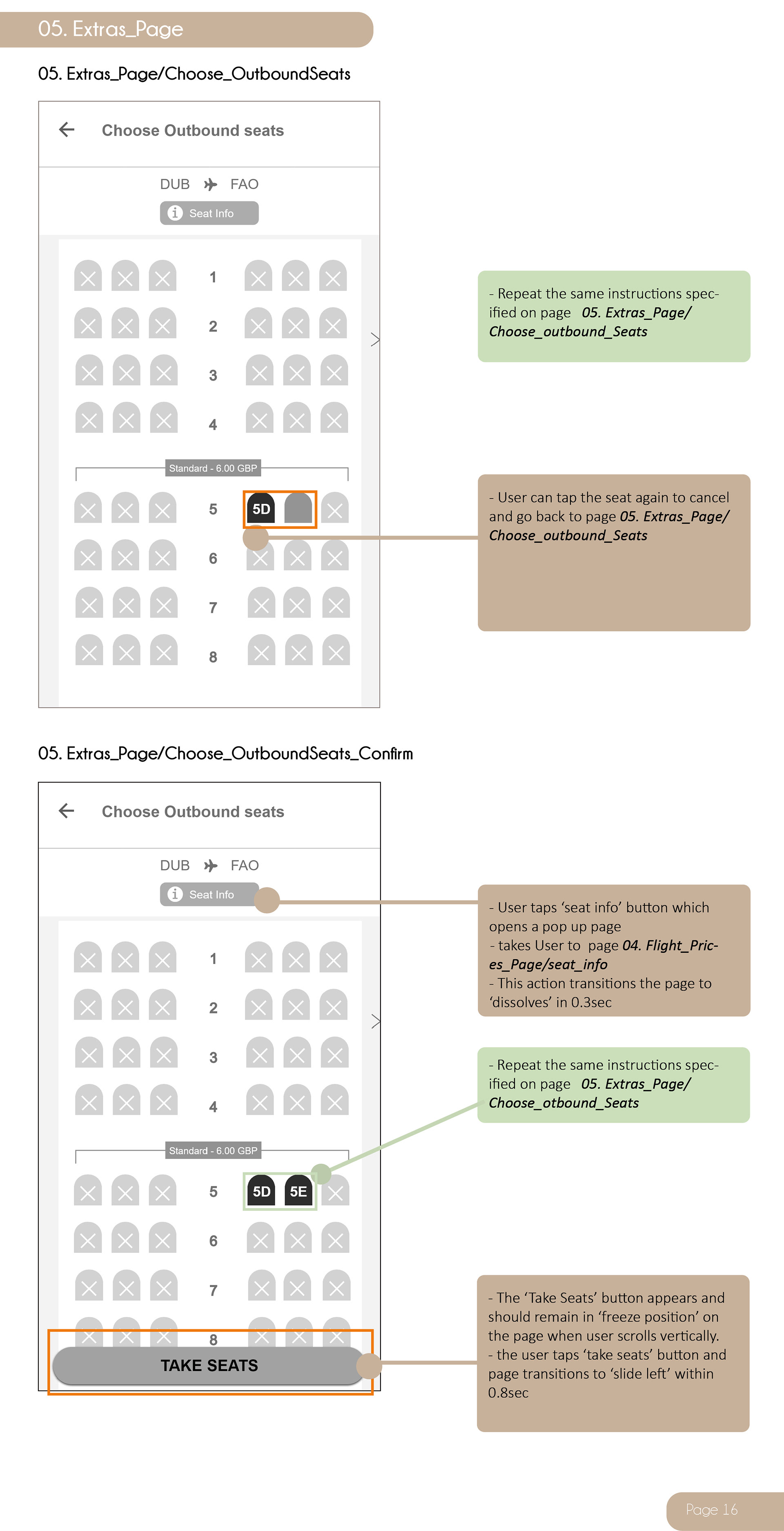
Wireframing
Wireframes were created for the developers to take the prototype into further development. I also conducted one more usability test with the same user I interviewed.
Project Reflection
I learnt so much from my research gathering stage, as well as adapting to new softwares.
Being empathetic towards the users' needs during the testing phase really brought major insights into how I should consider all options in the design/analysis stages.
I should have done the online survey first, because users used many other companies that I could have done more competitive benchmarking on, such as EasyJet, British Airways.
Wit the usability testing on user 3, I could have stopped them before proceeding to the next page to ask them what they expect the product to do next.
After conducting the 2nd usability test on user 3, the only feedback he had was that the phone size needed adjusting slightly to the device.