
Project Introduction
Akan Twi Guide is a simple language app that helps users learn how to speak and improve their vocabulary, comfortably communicating in Ghana’s native tongue. With its already engaging exercises such as quizzes, audio, sentence pronunciations and proverbs, it is known to be one of the most popular West African Language Apps out there.
Project Scope - This project took 6 months to complete, but 3 months if full time
Project Goals -to investigate how the subscription page works, how users interact with the app, and find a way to increase more subscribers, which increases revenue, and make it more appealing
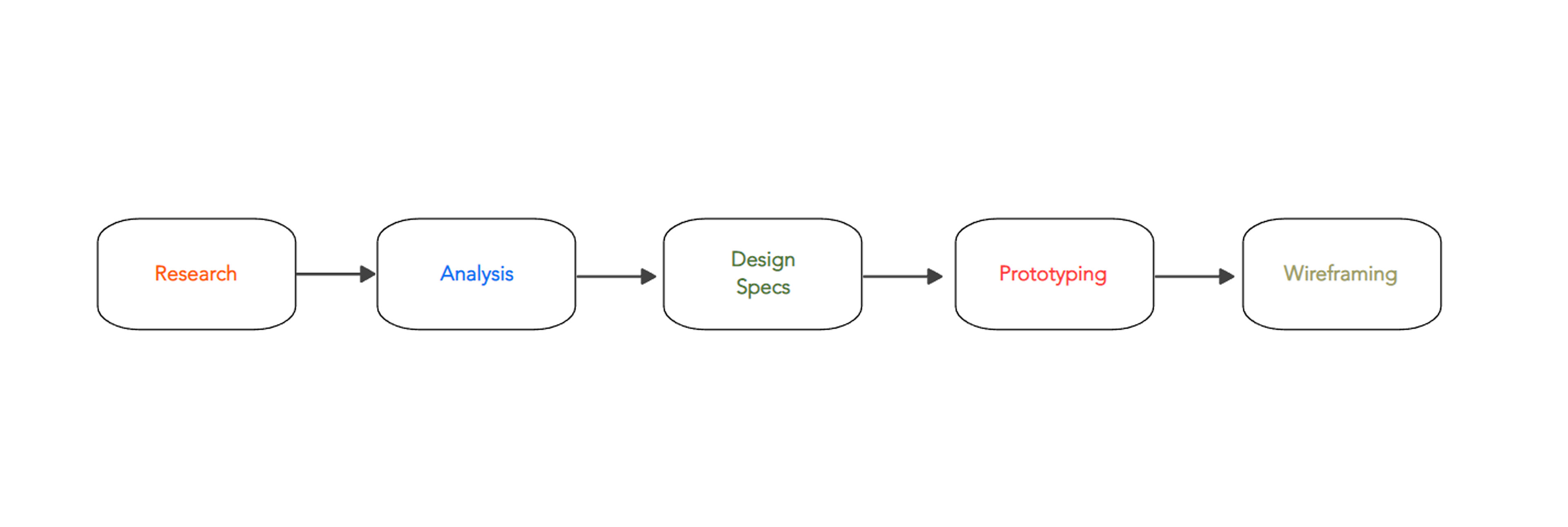
Methodology - Below is a diagram of the steps and methods I took on this project
Overview
In recent years there has been a massive surge of 2nd generation Ghanaians in the diaspora wanting to return back to their native country, Ghana, to learn their roots and to hopefully build a future, so learning the language and culture plays a crucial part.
Out of curiosity, I wanted to learn the language myself, since I had so many Ghanaian friends, and travelled there. So I did my searching and came across Akan Twi Guide.
Problem
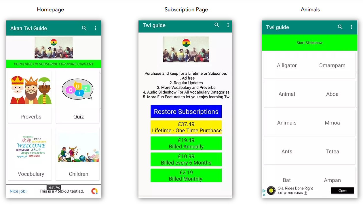
After carefully analysing the app, there have been good reviews on the type of content and simplicity that the app uses to engage with the users. However, the app design itself is outdated and has many issues. Below is a list of problems I identified within the design:
- The audio play buttons are missing on each exercise, which means I had to press the text by chance to listen
- There were multiple colours misused without reason
- The visual design such as text, are small on some pages and enormous on others. There is no formality which lowers the quality of the design.
- The images used are not consistent with each other and are low quality
- The navigation is confusing, and I lost my way a few times
- The content looked too cluttered and overwhelming, which can be off putting for new and experienced learners to choose from.
- The settings icon is not clear, but an actual menu
Research
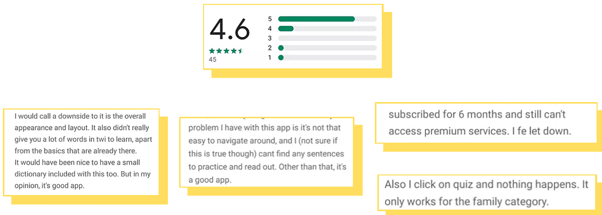
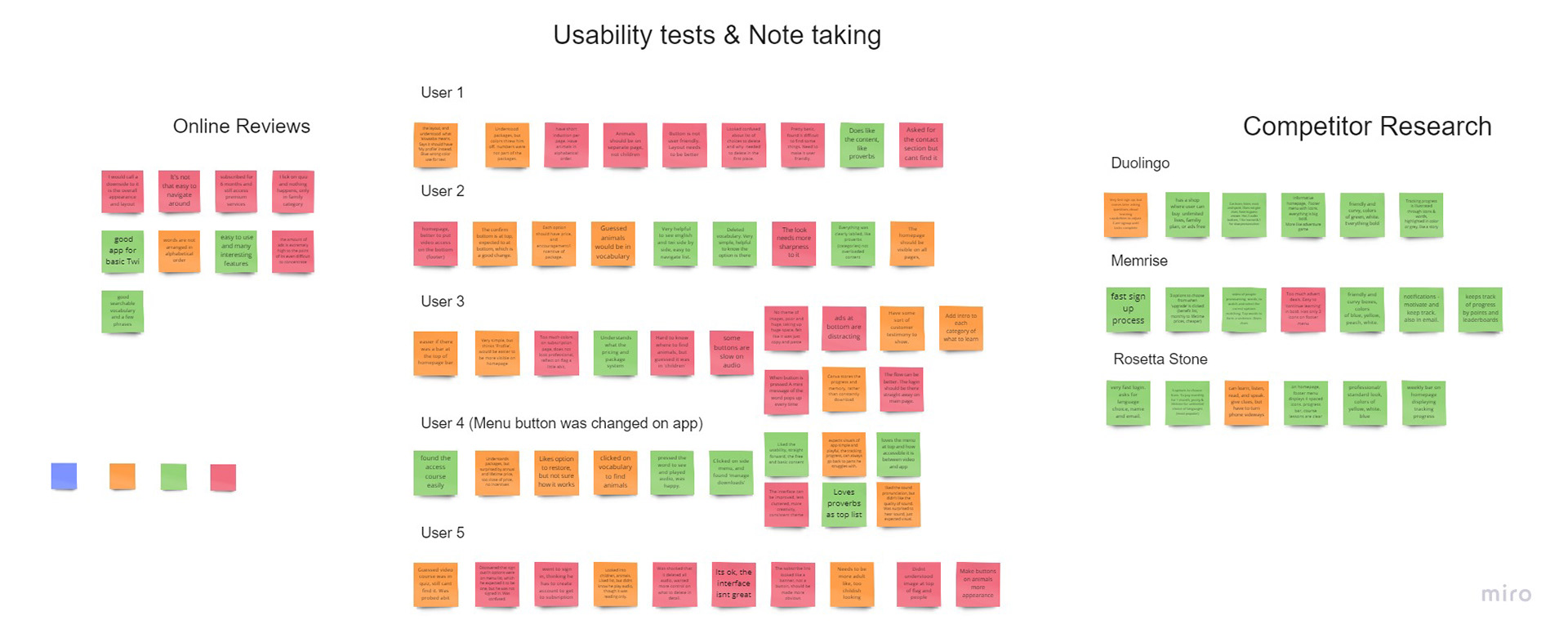
APP STORE REVIEWS
To not proceed on solely relying on my assumptions, as a starting point, I wanted to read the user reviews on play store. This is what I found.
COMPETITIVE BENCHMARKING
To develop a deeper understanding about navigation and interaction for users, I started looking at 3 best language apps on the market.

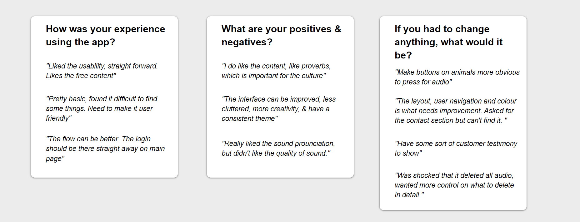
Note Taking & Usability Testing
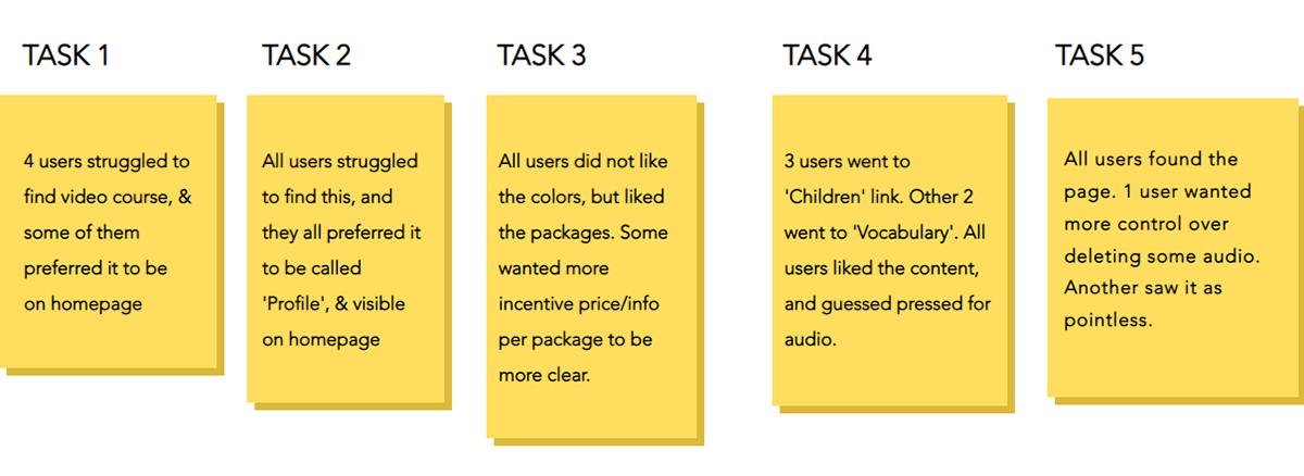
I interviewed 5 users who interacted with the Akan Twi Guide app, asking them open ended questions whilst I gave them 5 tasks to follow;
1. Locate and access the video course
2. Find and edit your profile
3. Find and subscribe to the app
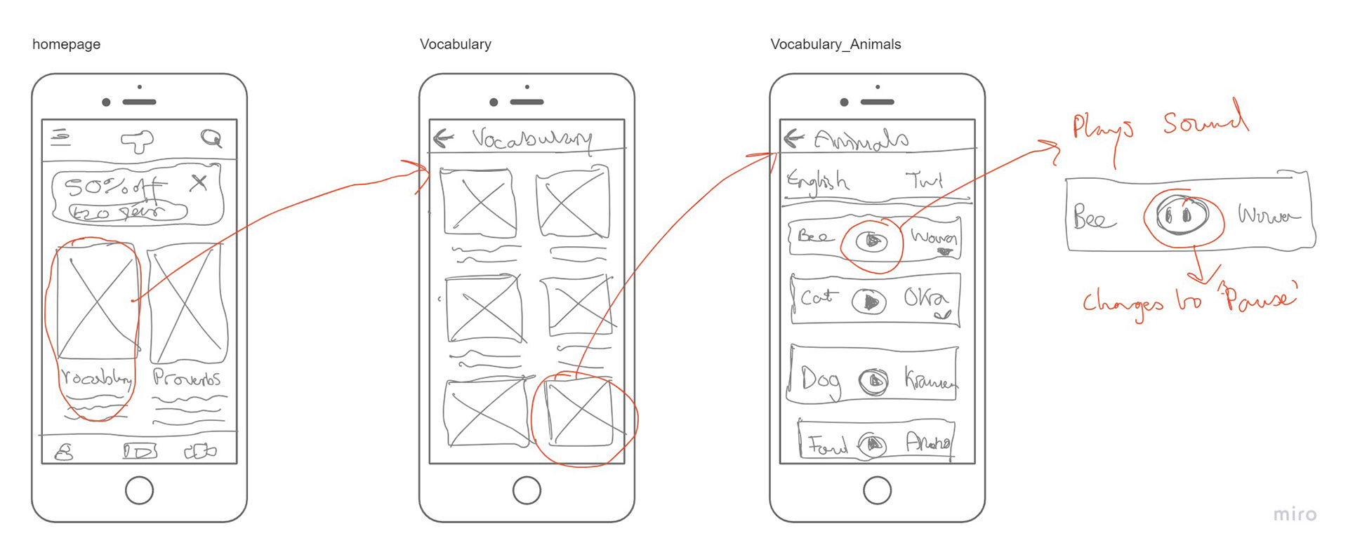
4. Find where you can learn about animals, and start learning it.
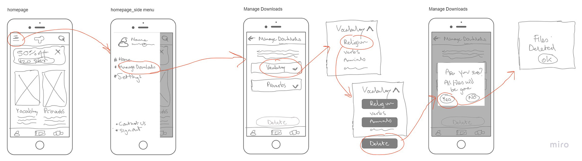
5. Please find and delete some storage
I chose these 5 tasks because they touch on all areas of the app, and I wanted to see how well the software responds to users.
Each participant in the test lasted about 15-20mins. Below is their main responses.
Overall feedback
Task Behaviour Stats
Analysis
After carefully analysing the data collected, I used the Affinity diagram technique to place all the notes into groups of screen pages, which became clear on what needed work on.
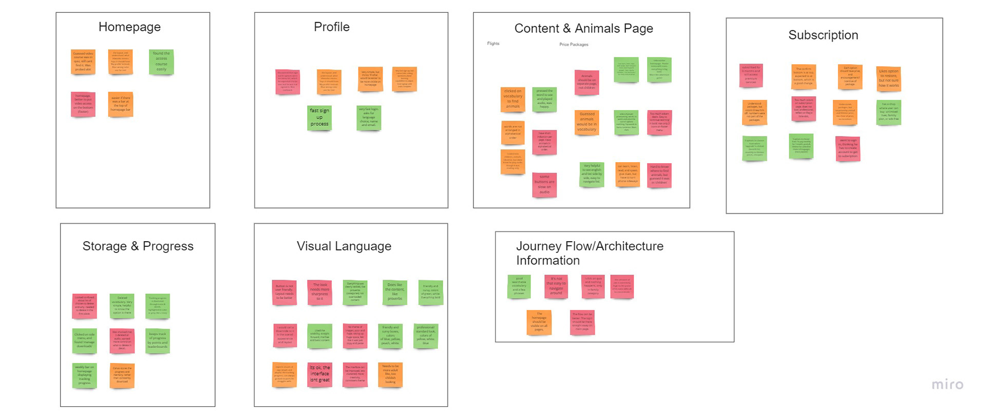
Without making any assumptions, I also created a customer journey map as a way to think about where the change of behaviours occurred during the process, and evidently there was a root problem discovered.

The Issue & The Solution
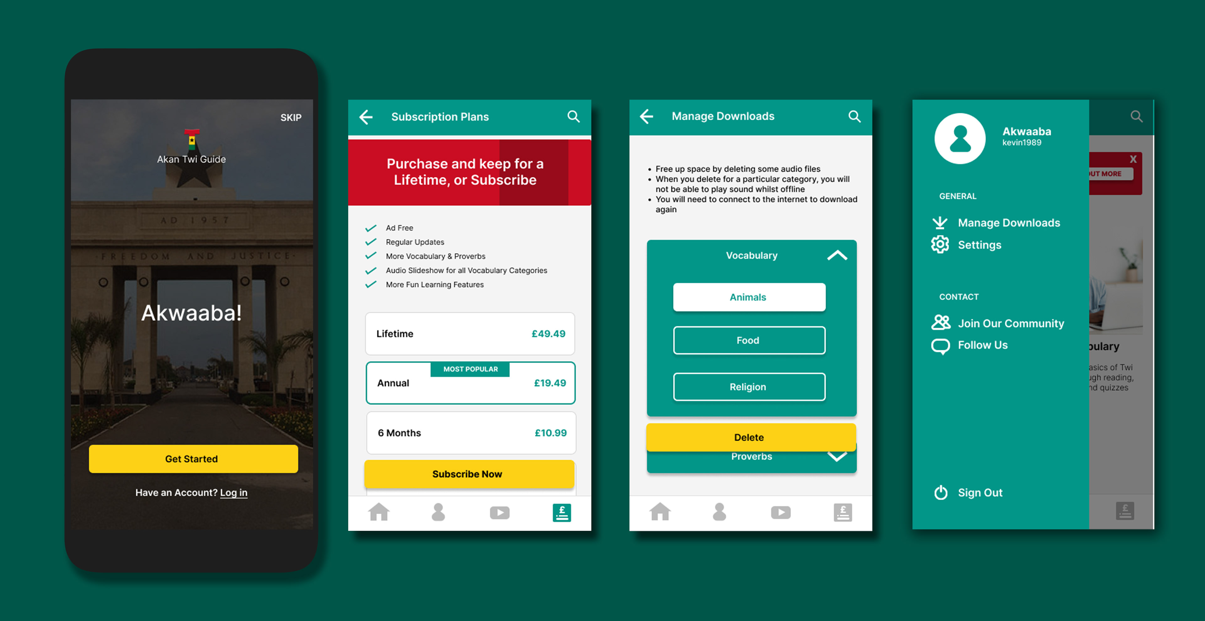
According to the customer journey map, I need to;
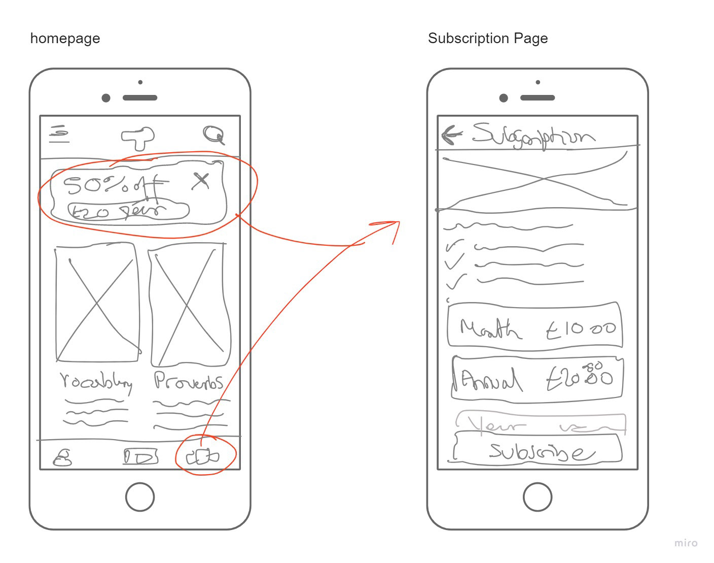
- Create a footer menu for easier access to video course, profile & subscription plans
- re organize the information architecture into appropriate titles
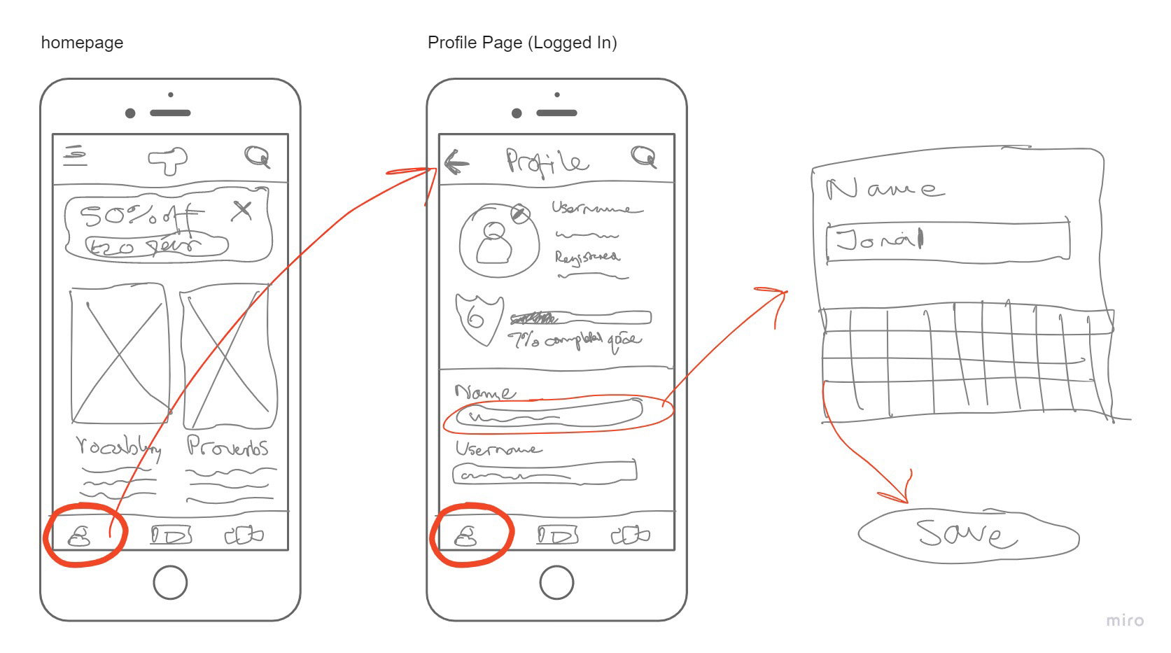
- create a profile that is easy to sign up to and edit
- Make sure the text hierarchy and imagery are aligned correctly
- give user more control over managing downloads
Ideation
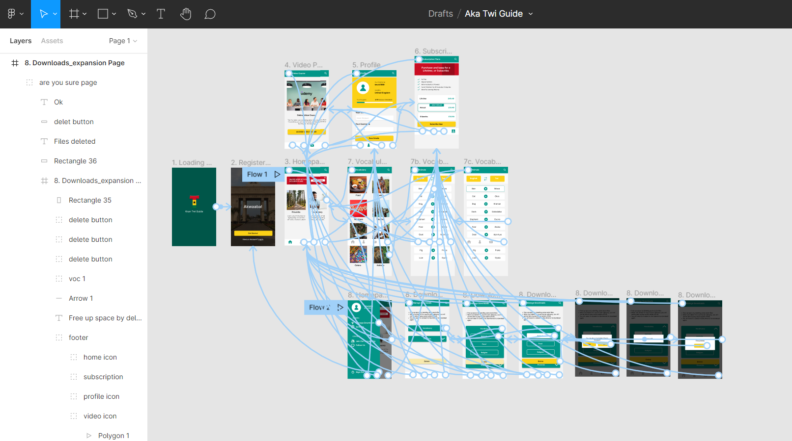
Now that I've defined the issues, it was time to look at the information architecture to start organising the content so the screen states flow easier and more understandable to the users.
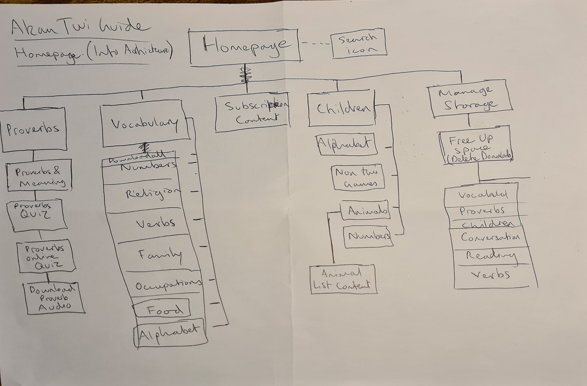
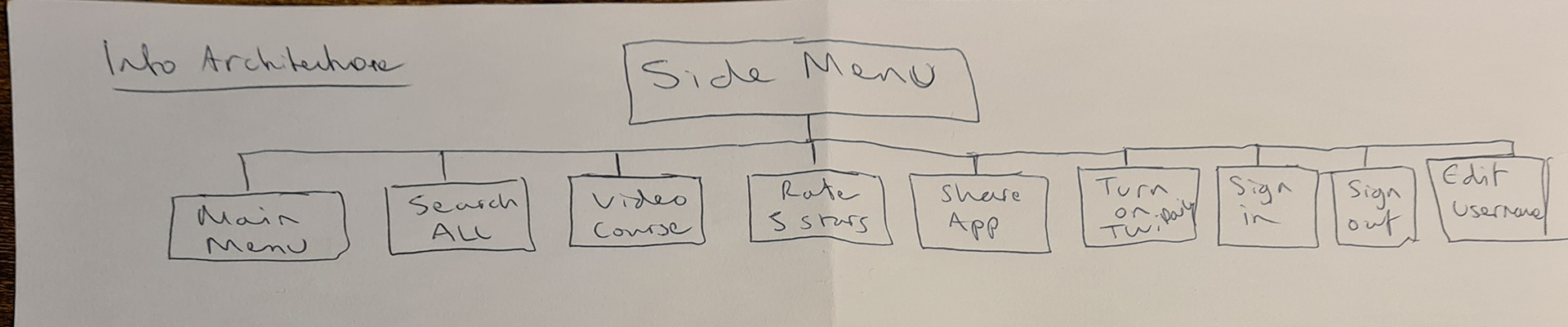
New Sitemap Suggestion
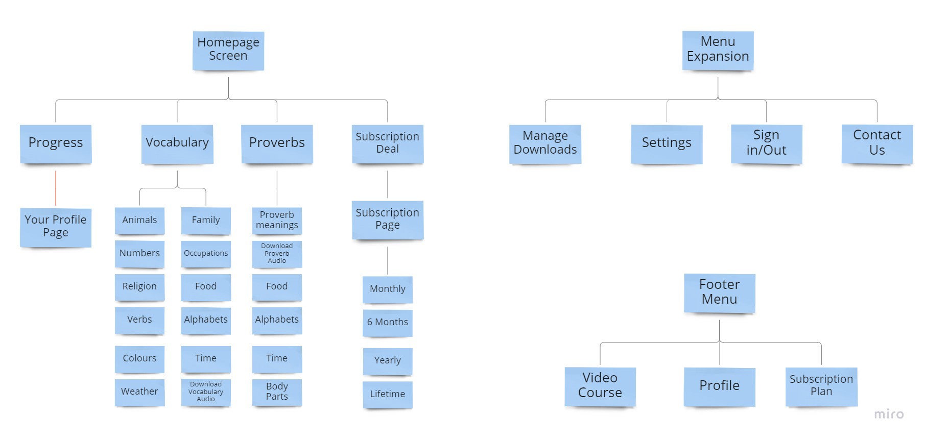
There may be a few pages I'll remove in later tage, but I just needed to get the AI right to then focus on the key tasks I tested the users on in detail.
Design Specs
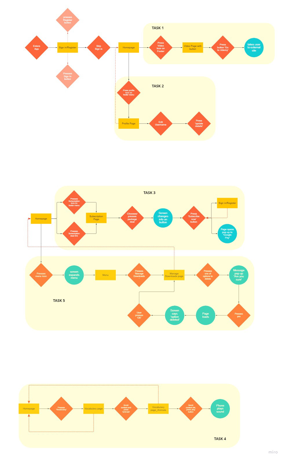
Interaction Design
Once I was happy with the flow diagram, it was time to start sketching each screen state in detail about the behaviours that the user expects from the software

Prototyping
High Fidelity Prototype
Using the interaction sketches in Miro, I started thinking carefully about the design look of the app. Without changing too much, I still aligned with the current logo and colors, but just wanted to make it more formal and friendly.
I hope you’ll enjoy the prototype. Click > ▶ Page 1 - Aka Twi Guide (figma.com)