Project Introduction
UE Airlines is start up company who is looking to create an online experience that is fast, easy, and intuitive for passengers: one that’s based on a deep understanding of their target users.
Project Scope - This project took 6 months to complete, but 3 months if full time
Project Goals - I want to create an airline prototype desktop that focusses on the flight booking process, using research and feedback from users
Methodology - Below is a diagram of the steps and methods I took on this project

Problem
Users who used airline platforms such as Euro Wings and Aer Lingus apps, had a problem in understanding what they were booking exactly, due to lack of information and flow of screen states.
Research
ONLINE SURVEY
I started creating an online survey to learn more about the goals of people that use airline sites: what they are aiming to do, whether anything is preventing them from doing it, and what other features they would like to see.
These were key findings I discovered;
- Users prefer to use desktop to book instead of mobile, by 12%
- Over 80% of users prefer to choose their own seats
- Easyjet and BA were the most popular airlines users last travelled with
- When travelling with others, they would go with close people/family
- Users want to see transfers options and overall comparison displayed.
- Around 30% of users travel with British Airways because of great customer service
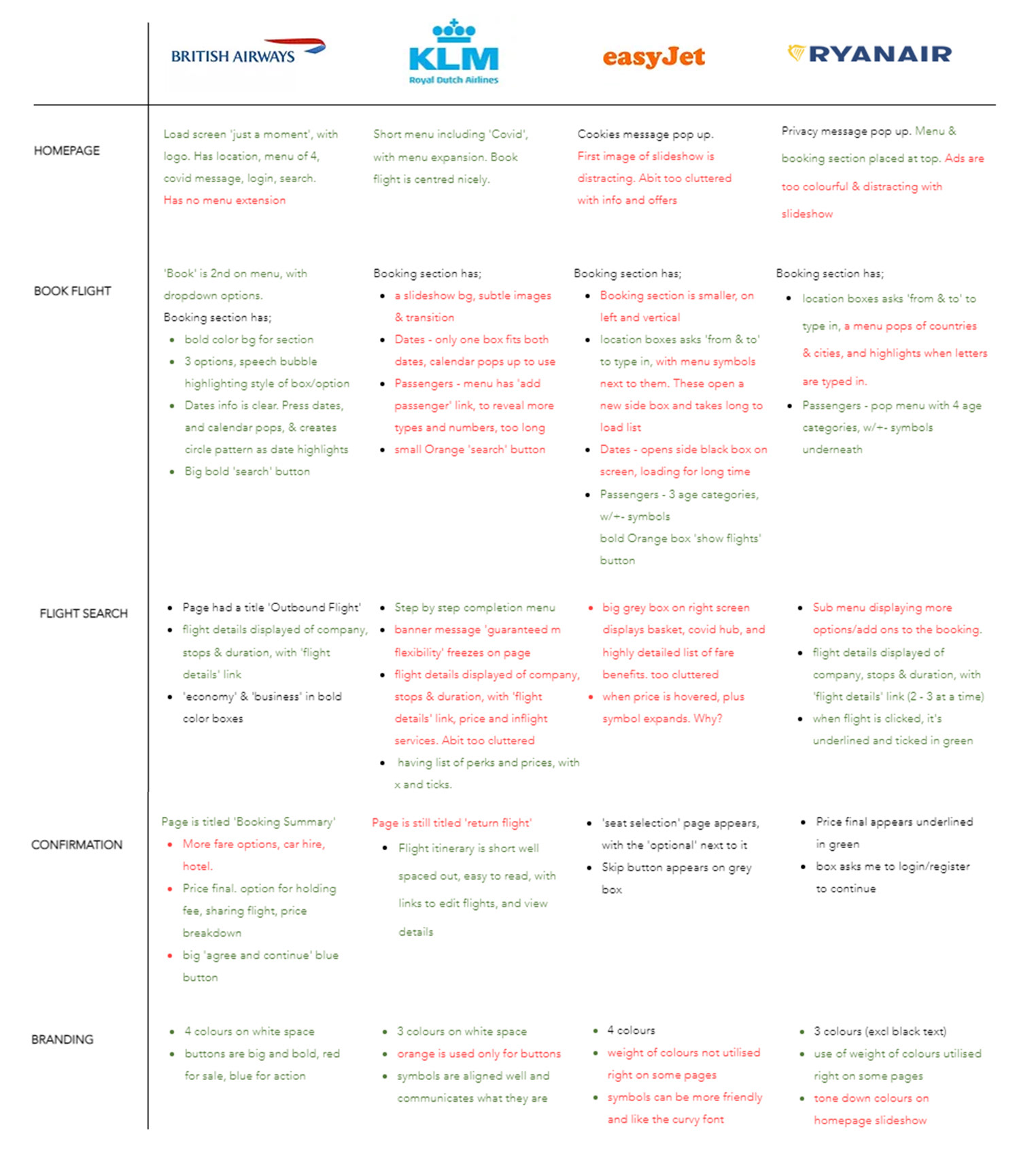
COMPETITIVE BENCHMARKING
Based on the survey findings, I chose the 4 most mentioned companies customers like to travel with, and looked at their booking process, evaluating them in 6 different areas of the booking process
Note Taking & Usability Testing
I conducted these methods on 3 users who interacted with 2 airline apps, Aer Lingus and Eurowings, with the following questions;
What do you see on the page?
What does this button/option mean to you?
Overall, what did you think of your experience?
Was there anything you expected to see?
Were there any surprises?
How do you find navigating this page?
Each test lasted about 45mins. Below is the users' main responses.
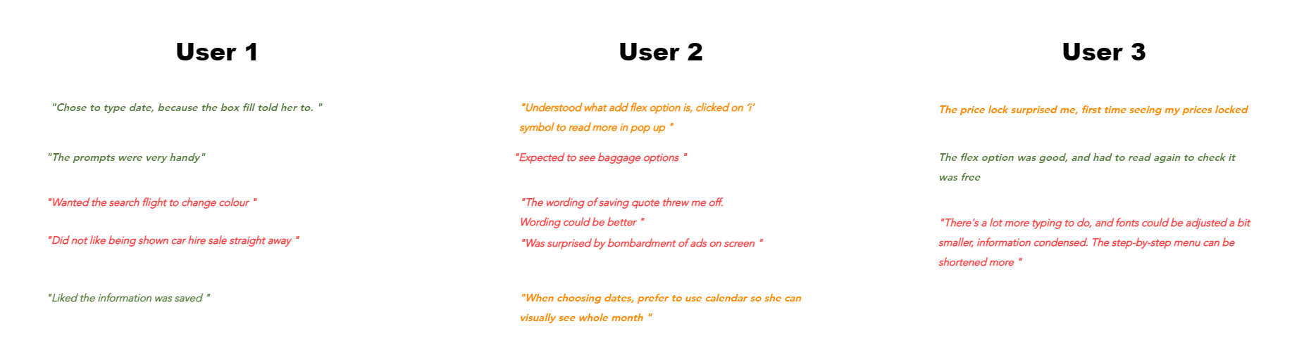
For each user, not only did I record their speech, but also their face expressions, and time that they took to perform each task. This would be my final research gathering to then analyse properly.
Analysis
After carefully analysing the data collected, I used the Affinity diagram technique to place all the notes into groups of screen pages, which became clear on what needed work on.
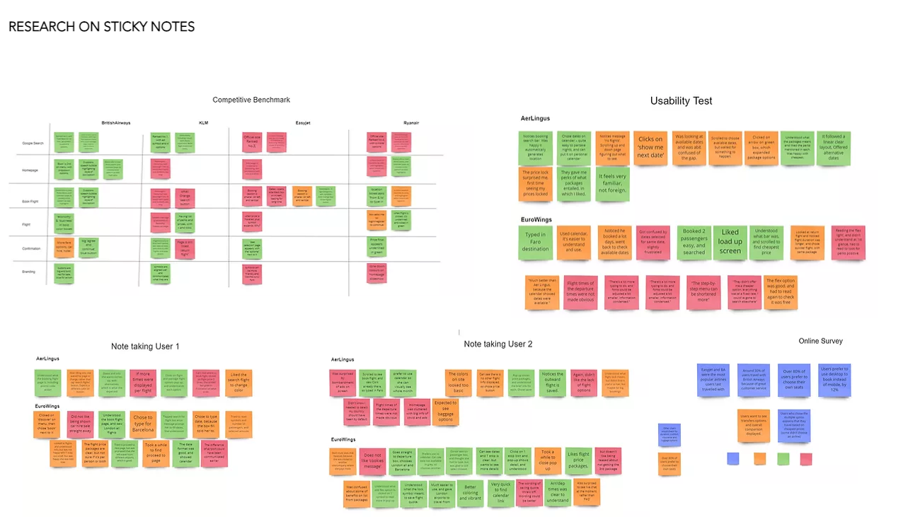
Rearranging them into the different stages according to user feedback, painted a clearer picture of what needed working on.

Affinity diagramming is a good starting point in formulating all the data gathered into groups, but it still wasn't not clear.
I created a customer journey map as a way to think about where the change of behaviours occurred during the process, and evidently there was a root problem discovered.

The Issue & The Solution
According to the customer journey map, I need to;
- remove ads, replace imagery and information on homepage
- make the booking section more clear with bold colors, symbols and buttons the user can understand
- edit the calendar selected dates, for user to understand
- make symbols aligned with text and colors
- make flight options more accessible and readable
- declutter step by step bar, and adjust text hierarchy
Design Specs
Interaction Design
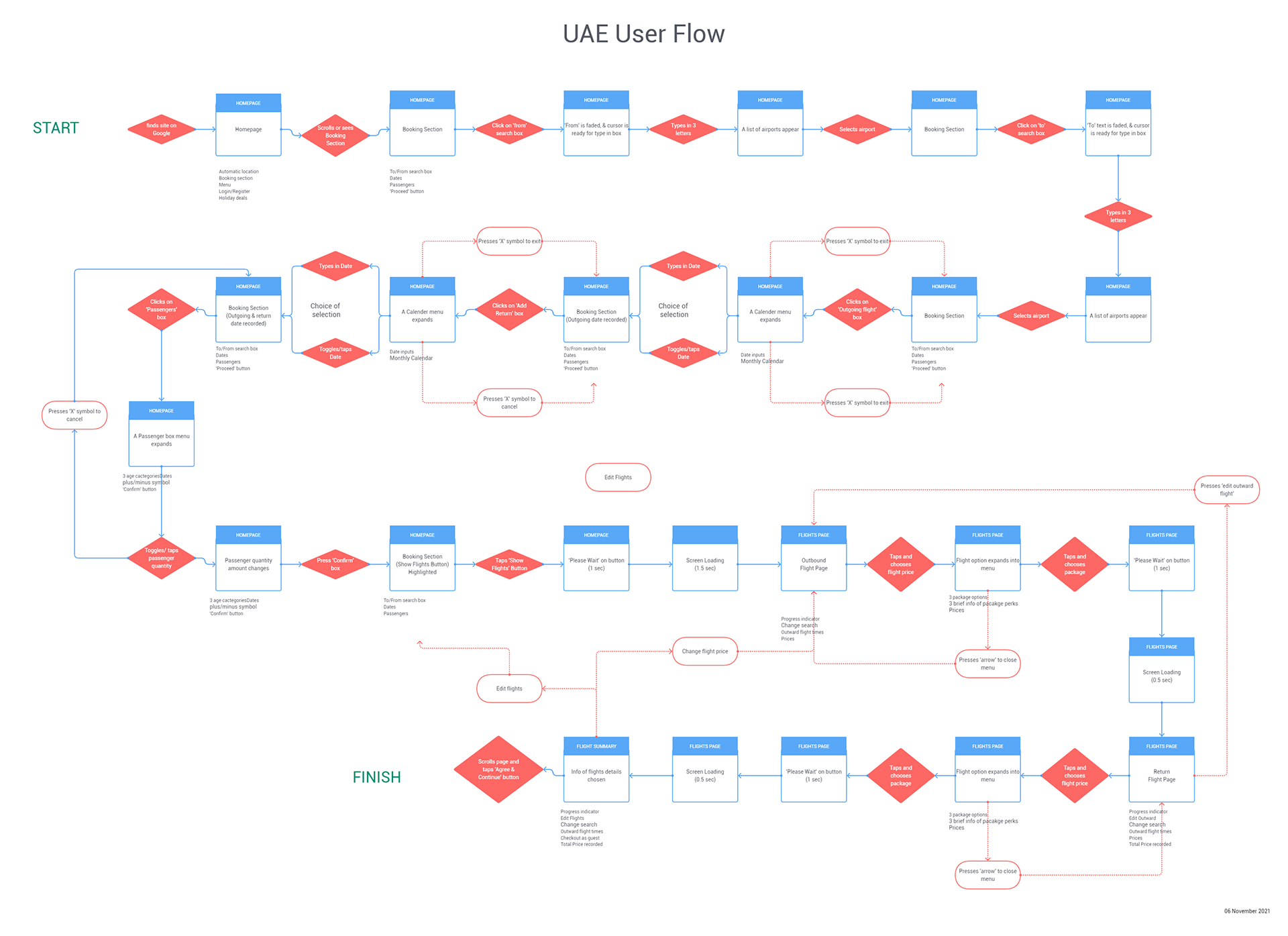
I began sketching and experimenting with different screen states on a flow diagram to find ways in making the overall booking process run as smoothly as possible
Once I was happy, I created the digital version, still referring back to the Customer Journey map as a guidance.
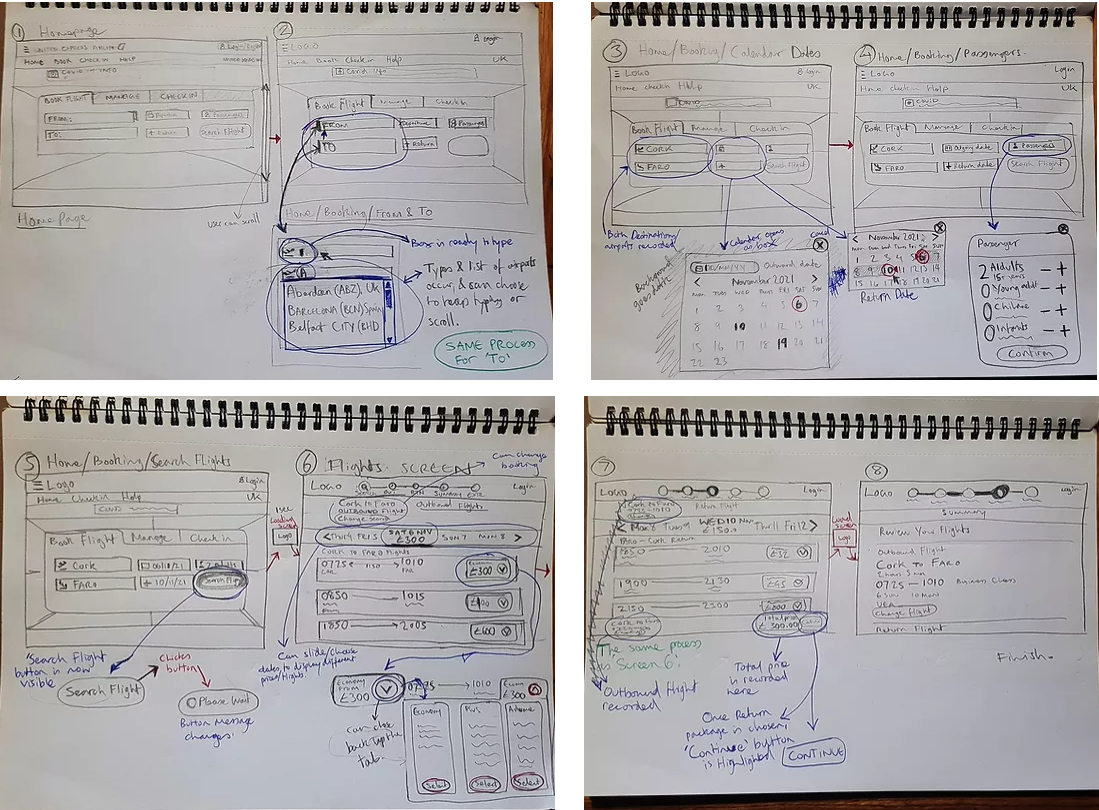
I started creating low fidelity sketches of what each screen state would look like in detail.
Still referring back to the Customer Journey map as a directional compass.
Prototyping
Branding
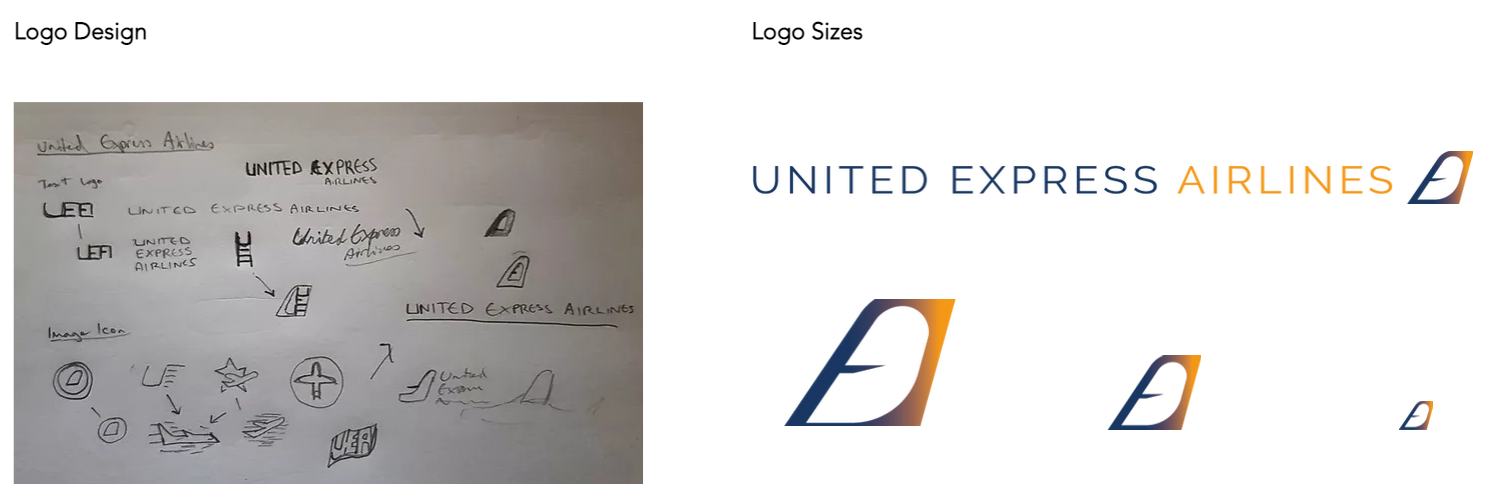
Still remembering the notes I took down from the Usability tests, and competitors' branding, I started thinking about how I could convey strong colours, as well as a prestige look that had a sense of professionalism, comfort, and easy travel with no problems. Instead of using Fly UX, I came with a new name, United Express Airlines.
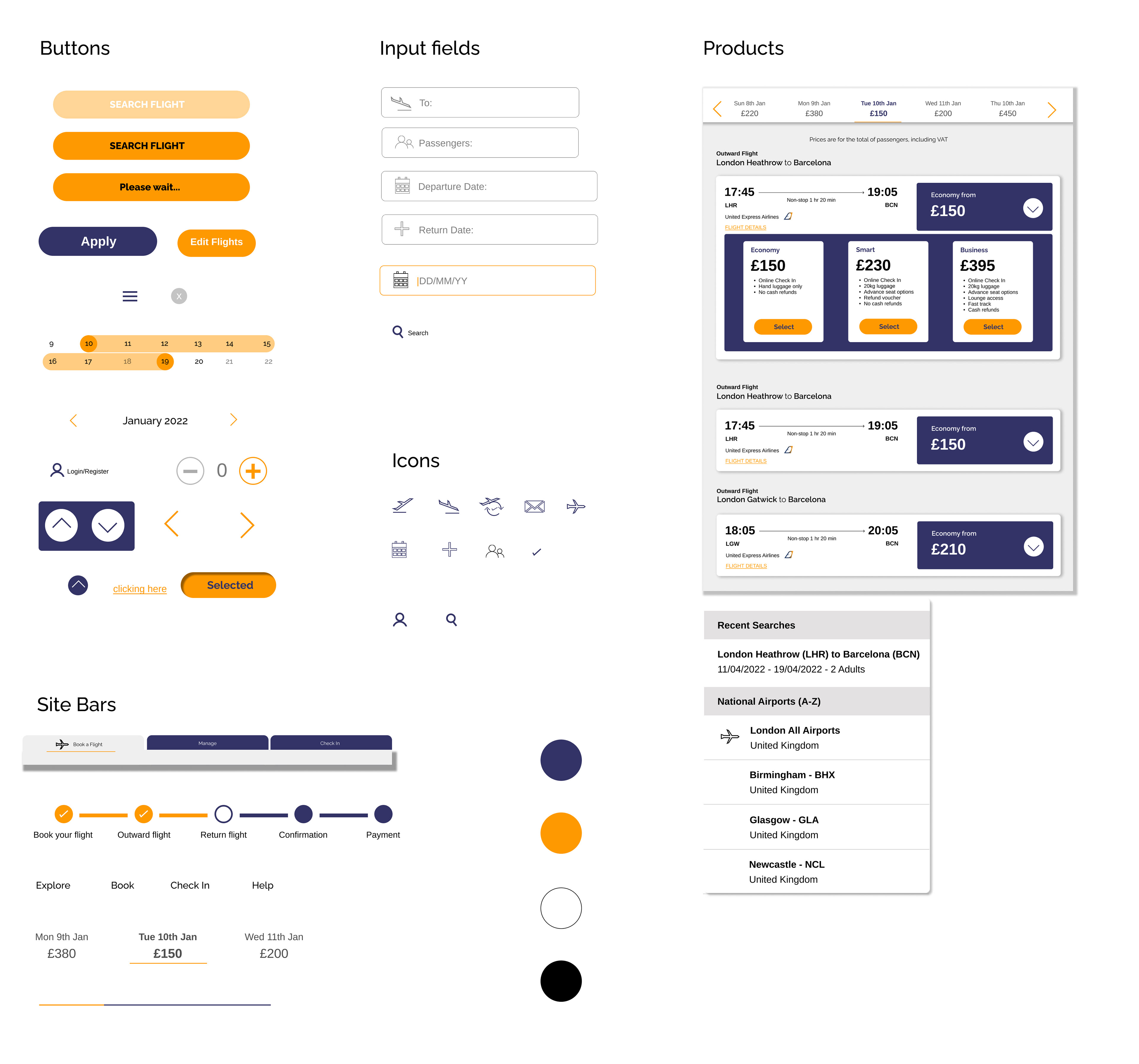
UI Kit
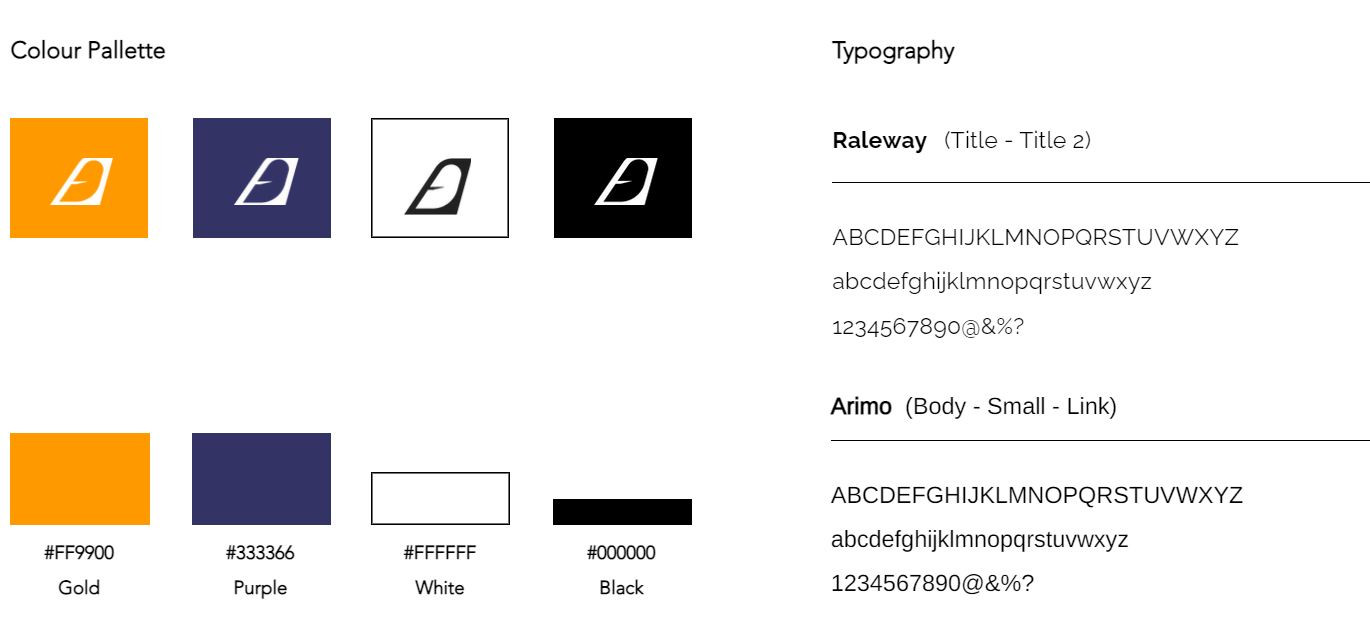
Using the brand kit above, I carefully started to think about this incorporated into the software, using clean icons that represent the company brand
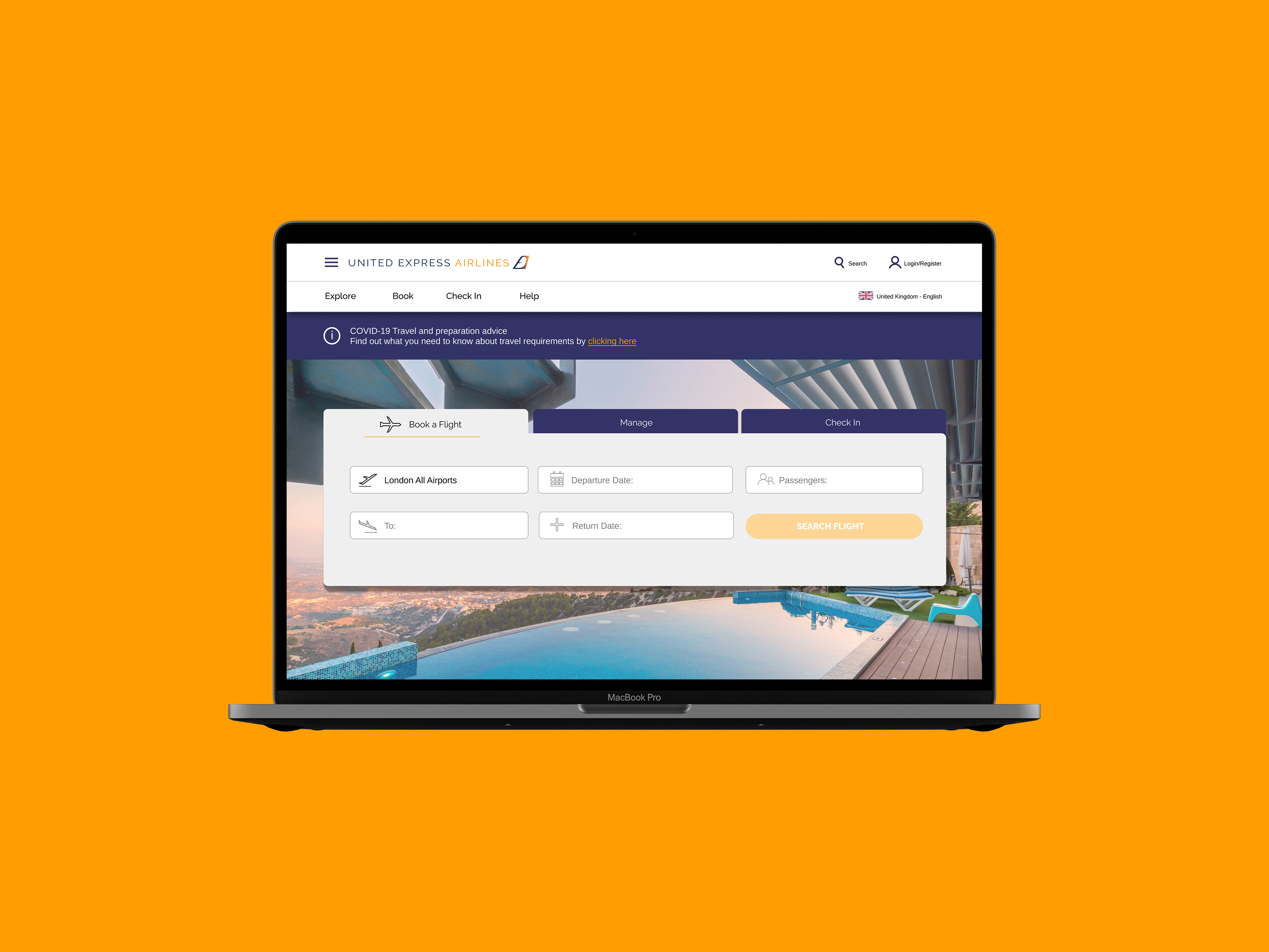
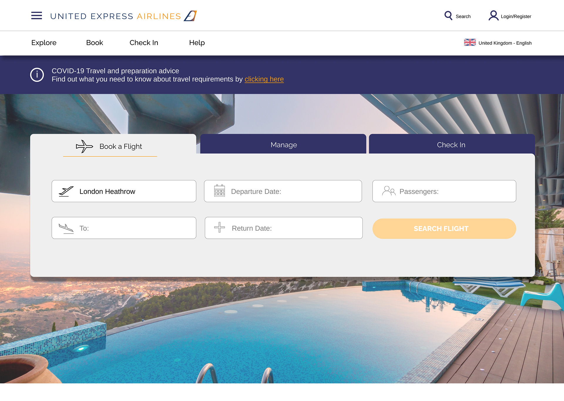
High Fidelity Prototype
After taking the interaction sketches to Figma, I realized that the process of UI took longer than anticipated, coming from a graphic design background. All elements were designed in Adobe Illustrator to match the logo and branding
Below is the prototype interactive links of screen states
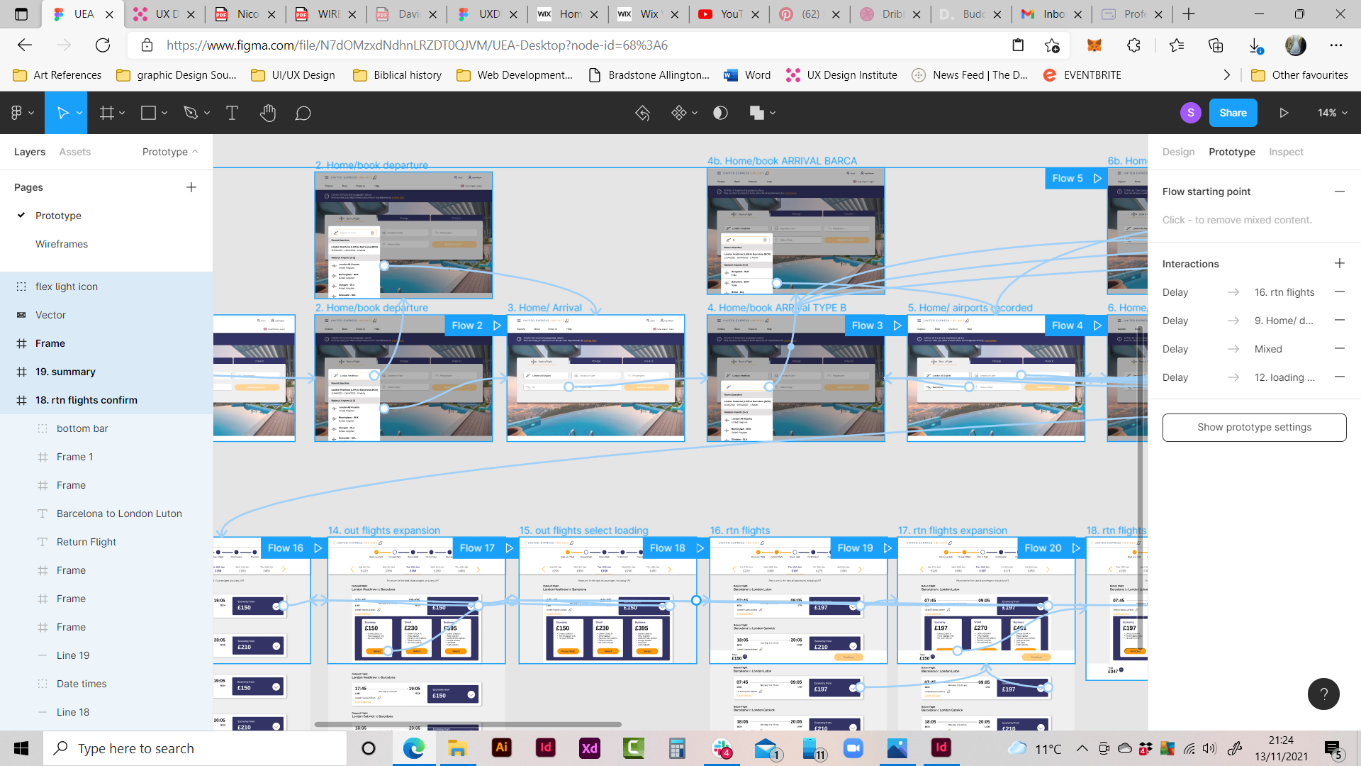
I hope you’ll enjoy the prototype. Click > Desktop Prototype
Wireframing
Wireframes were created for the developers to take the prototype into further development.


Project Reflection
I enjoyed learning how to use Figma, as it has more functions than Adobe XD
Using more research techniques such as competitive benchmarking, in detail, to understand what users expect to come across
Exploring the world of UI, and understanding how to communicate icons a long with the use of CJM
I found it slightly troubling keeping up spending a lot of time building the prototype, as it was my first time using it
Can definitely conduct more user tests to get more insights
Need to be more familiar with frontend development terminologies used to speak with developers in annotating the wireframes